Posts

Showing posts from April, 2023

Animation

Image
 For our final project in photoshop, we were assigned to create a small animation. My first thought was to do something simple because I was not too skilled in the previous animation exercises. I still wanted it to be fun to look at though, so I chose a fun scene of a shooting star. I found the images I used on the internet and cropped them in an app on my phone. I then exported the images to the computer and began to work. The small animation is two people on a mountain top watching a shooting star in the night sky. I like how the two people are just a silhouette, because the the relationship and identity of the two people is left open for interpretation. I also included my tagbrush and name/ class to identify the artist. I have attached the images as well as the animation. 
Business Cards

Image
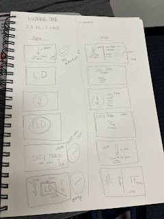
 One of our final projects was to design three different business cards and use Adobe InDesign to bring our ideas to life. I looked for inspiration on the internet by just looking up different types of business cards. I drew up 12 different designs, 6 for the front of a card with a corresponding 6 backs. I tried different orientations and even decided on one that is vertical from the front and horizontal from the back. I think my logo looks great for a business card because it is simple and cute, but does enough for itself that it can be used as the main and only design. I also used my name and initials as thew key part to a lot of the designs because I discovered how common that is through researching different business cards. I have attached my original ideas/ drawings as well as my final projects. 

Post Card

Image
For our recent project, we were assigned in designing a post card. I chose a place that is near and dear to my heart: my local beach town, Saint George Island. I grew up going to this beach and one of my childhood best friends' grandparents own some real estate on the island. Her grandmother used to show us old photos of the island before it grew, and one aspect has truly stayed the same since then: the lighthouse. You can tour the light house any time you want when you visit and it is smack dab in the middle of the island. I chose to use an image of the light house due to how iconic it is.  For design, I went for simple because SGI is a very simple place. It's small and relaxed so I did a relaxed and "low maintenance" design. For the back, I also kept it simple. I made sure to include the "signing" lines that are very postcard-y.  I also included the abbreviation "SGI" because that is what the locals call it, and I think it added a nice touch.

BW to Color

Image
 The Black and White to Color project is a way to show a new skill learned in AdobePhotoshop. The goal was to take a photo of yourself, edit it to be black and white, and then recolor the image using the adobe color wheel. I did 3 different color variations: Complementary, analogous, and monochromatic. I will upload the photos in the same order. I tried to choose three different groupings of colors as well to try new things. It was a bit difficult getting the smaller parts in the image, such as facial details and branches in the background, but it was doable. I like how it started as black and white because it was essentially a "fresh canvas" in a way.  Attached below is the original B&W photo, with the redone photos following. The order in which they are posted can be referenced in the previous paragraph. 

"Somewhere" Project

Image
 The "Somewhere" project was a lot of fun for me. The objective was to edit an image of ourself into a movie scene of our choosing. I had a lot of ideas for this project but I then realized I had thr perfect photo of myself to use for a particular movie scene that I really like. The scene I chose is from the movie, "Neon Genesis: The End of Evangelion". This movie is very special to me because a friend introduced me to it and I relate it to happy times.  The original scene is the first inserted image. I (again) came to realize I had the perfectly angled photo of my face to match up with the face in the background of the scene, which is the second image included. The final image is the final project. I edited my face to be more pale/white so that it would be more similar to the movie scene. I am glad I chose an anime because I wanted to challenge myself by working with a scene that wasn't "real life". 
  lD H1 Homework Lucy Duke FMX https://www.youtube.com/watch?v=0eqhUFRlvgI I clicked on this video because it goes over IDH1 as a whole, rather than separate parts. It had a lot of positive comments about how informative it was, so I had to try it out. It definitely delivered. It briefly, yet clearly, described all tools and their uses. I think this is useful because even if you don’t know anything about the program, the video gives a great baseline and gets you used to the lingo for the software.  https://www.youtube.com/watch?v=yCAaLlrty1A I chose this video because it is a bit more specific on certain features of Adobe In Design, mostly because it guides you on how to complete a certain project rather than just how to use a tool. The video shows you how to make a presentation design, which is very useful for classes. Also once you learn how to make a presentation design with certain tools, you can easily figure out how to do other projects with the previous knowledge . http...